30 Jun 2014

Get The Look | Montauk Hotel Inspiration
3

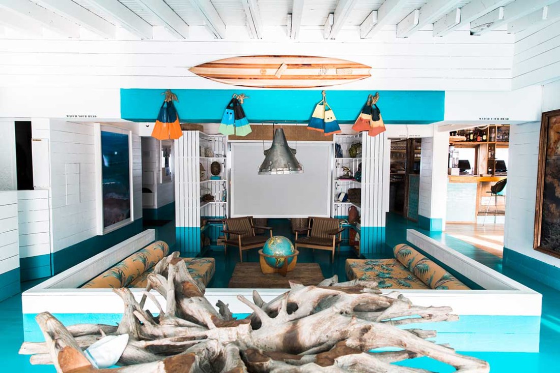
The-Surf-Lodge

The first time I visited to Montauk was the summer of 2013. My friends and I were staying in East Hampton and we realized that it would only take us about 30 minutes to drive to Montauk so we decided to dedicate our Saturday afternoon to this quaint little beach town. Let’s say that as soon as we stepped foot in town, I knew I would come back for years to come.

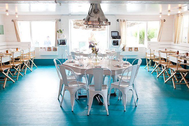
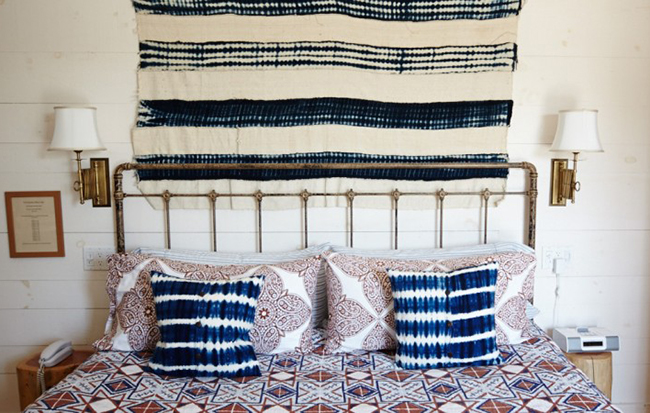
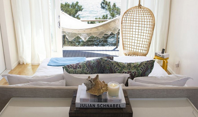
There are so many great places to stay including Montauk Yacht Club, Sole East’s Resort,  and Gunrey’s Inn but one spot in particular that I absolutely love, whether to stay or just to visit is the lovely Surf Lodge. Built in 1967, Surf Lodge has become a popular destination for both local and international travelers looking for the perfect place for relaxing, sunshine, surfing, fishing, exceptional dining and more importantly, happy hour with a view.What I love most about Surf Lodge, is their attention to detail when it comes to the interior of the hotel, restaurant and patio. The character of the hotel truly reflects the locals laid back, relaxed demeanor.

Today I thought it’d be fun to round up a few items to help you get the ultimate Montauk hotel vibe.

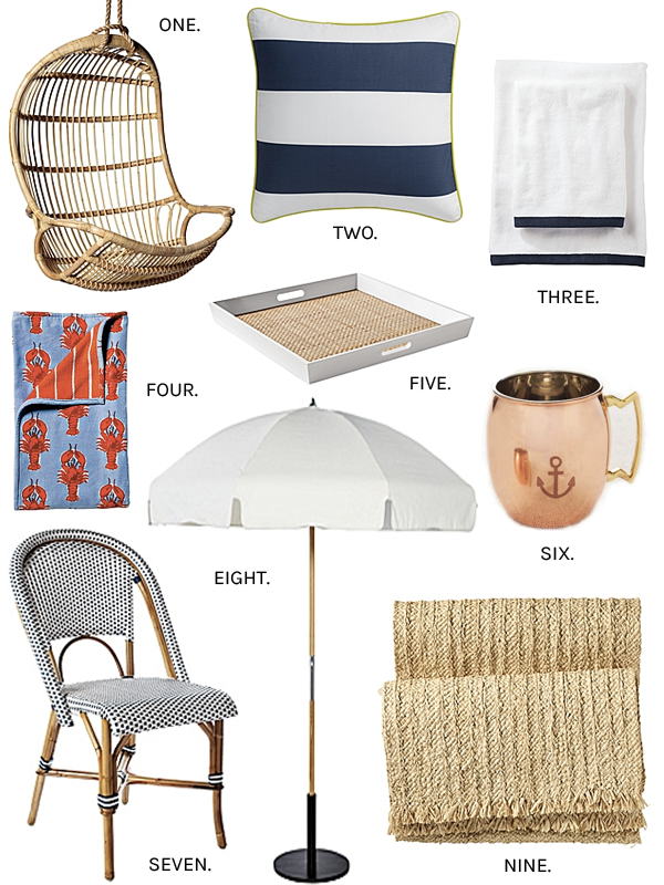
Serena and Lilly in particular have so many items to help you get the look – insert Serena and Lilly’s Navy and White Pillow, the Serena and Lilly Border Frame Bath Towels and my favorite, Serena and Lilly Hanging Rattan Chair. Have you been to Montauk Yacht Club or Surf Lodge in the past? You can shop more Montauk inspired items below. Xo. Lauren

Montauk Surf Lodge

the-surf-lodge-montauk-hotel-room-3

the-surf-lodge-byron-restaurant-montauk-4

the-surf-lodge-montauk-hotel-deck-7

the-crows-nest-inn-montauk-6

Get The Look

Montauk Hotel Inspiration R2

 West Elm Moscow Mule Copper Mugs // Serena and Lilly Hanging Rattan Chair // Stephanie Sherman Wipe Out Print// Serena and Lilly Market Umbrella // The Big Book of the Hamptons  // Raffia Runner // Navy and White Pillow // Riviera Side Chair // Border Frame Navy & White Bath Towels
gift

Shop The Post

17 Jun 2014

How To Decorate With Books
3

When it comes to updating a space, decorating with books is one of my favorite ways to accessorize, add color, and display some of your favorite reads. There are so many picturesque coffee table books that it’s easier than ever to add color to a room. Overwhelming? It can be. I’ve rounded up 5 key tips on how to decorate with books so you can give your shelves that magical touch!

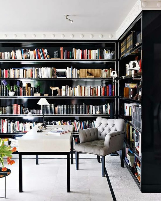
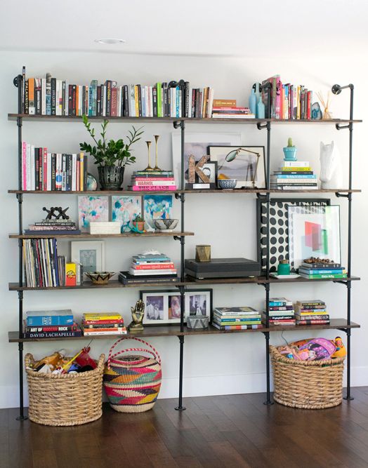
1. Keep to a general color scheme. I personally love when book shelves line the walls of a room but it’s important to keep shelving the same color and/or style.

How To Decorate With Books_1

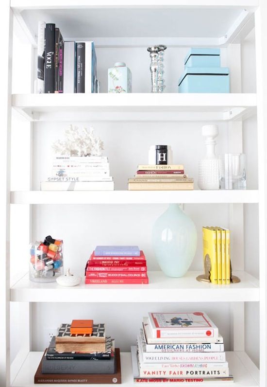
2. Go Horizontal. Gone are the days when book collections are displayed vertical across the entire shelf. Displaying your books horizontally can feel weirdly calming and serene. And don’t limit yourself to books, you know those magazines that have piled up on your night stand? It’s the perfect time to put them to use.

How To Decorate With Books 5

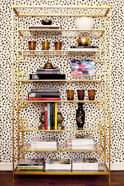
3. Accessorize between books. When you decorate with books, be sure to accessorize in between groupings. Whether you prefer to display your books vertically or horizontally, displaying different home accessories in between groupings will help create an eye catching and stylish vignette. Some of my favorite home accessories to utilize on bookshelves include this Jayson Home feather, mirrored frames, or a creative print.

Domain

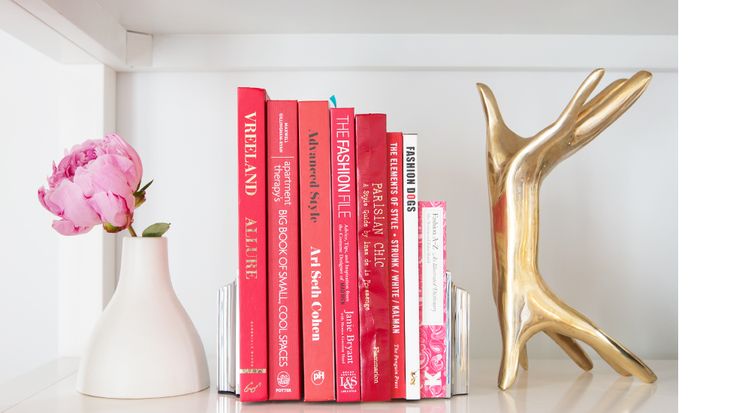
4. Group by Color. One of my favorite tips when decorating with books is grouping them by color. This will help create a visual balance on your shelf. And who doesn’t want visual balance?

books2


5. Pay attention to scale. To ensure your bookshelf creates plenty of interest, be sure to keep in mind variations in height, shape and volume. One good way to do this is to accessorize with items that have similar style.

how to decorate with books 6

{Images 1 // 2 // 3 // 4 // 5}

20 May 2014

How To Create The Ultimate Gallery Wall
7

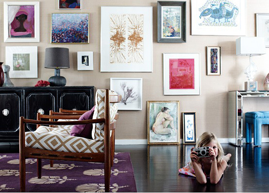
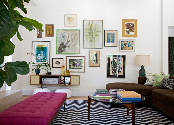
When it comes to updating a space, the gallery wall can be the perfect solution…when it’s done right. From entryways to dining rooms, an eclectic display of frames can be incorporated in just about any room. I personally love them above couches, in children’s rooms or hallways. Today I’ve rounded up five key design tips for creating the ultimate gallery wall.

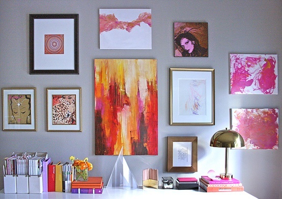
One. Keep to a general color scheme. This is key to creating a cohesive look with numerous pieces. Whether it’s black, gold or silver, a general color scheme will allow your wall to look clean and put together.

Erika Brechtel

Photo via Erika Brechtel

Two. Display paintings, prints and pictures. Are you drawn to black and white photos? Do you have one-of-a-kind artwork you want to display? This is the perfect opportunity to tell a unique story of your travels and adventures.

Alaina Karczmarski

Photo via Alaina Karczmarksi of the Everygirl and Live Creating Yourself //Photographer Maia Harms

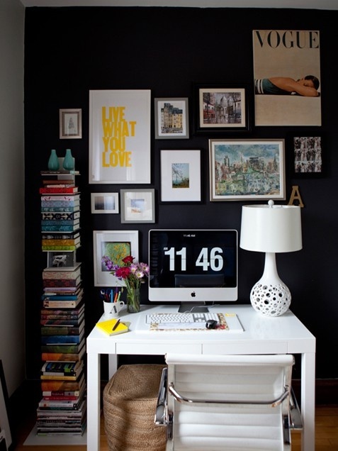
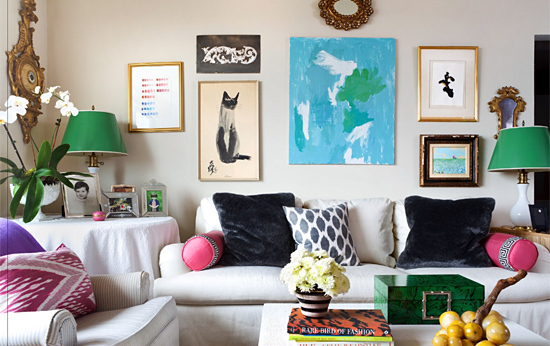
Three. Mix contemporary, antique and personal pieces. Mixing in antique frames is one of the best ways to add a personal touch. It’s also a great way to display items you have collected over the years.

Paloma Contreras of High Gloss Magazine and La Dolce Vita

Photo via Paloma Contreras of High Gloss magazine and La Dolce Vita

Four. Lay out the frames on the floor before hanging. This will help you visualize how your wall will look when it’s complete.

Angie_Haranowsky2

 Photo via Angie Haranowsky

Five. Start with two to four pieces in the center of the wall. Don’t be afraid to use pairs and be sure to keep the frames at the same height to establish your focal point.

Angie_Haranowsky4

Photo via Angie Haranowsky


15 May 2014

Small Spaces with Big Style | The Powder Room
0

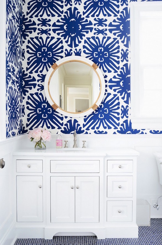
Blue-And-White-Bathroom

Let’s talk powder rooms today, shall we?

I have been noticing their recent popularity throughout trade magazines and Pinterest so I did a little research & digging for my own interior knowledge. I discovered that the term “powder room” came about in the 18th century, where people went to “re-powder” their wigs.

The term remained popular all the way through the Victorian era where the “powder room” began to be referred to as the general bathroom area. Rather than having to say “I have to go to the bathroom,” women of the Victorian era created the phrase we all know and love, “I must go powder my nose” when in mixed company to excuse themselves. Whether this is true or not, I still love mimicking the phrase when going to the bathroom with a group of girlfriends (you all know we have to go in packs!).

The powder room inception was designed to only host a toilet + sink and to this day, remains to be located most commonly on the first floor of a home. Although powder rooms rooms are small spaces, it’s the perfect opportunity to get creative with this small space! The ones I have been obsessing over on Pinterest usually utilize a large print or colorful wallpaper.  How pretty is Sue’s blue and white powder room pictured above?! #goals.

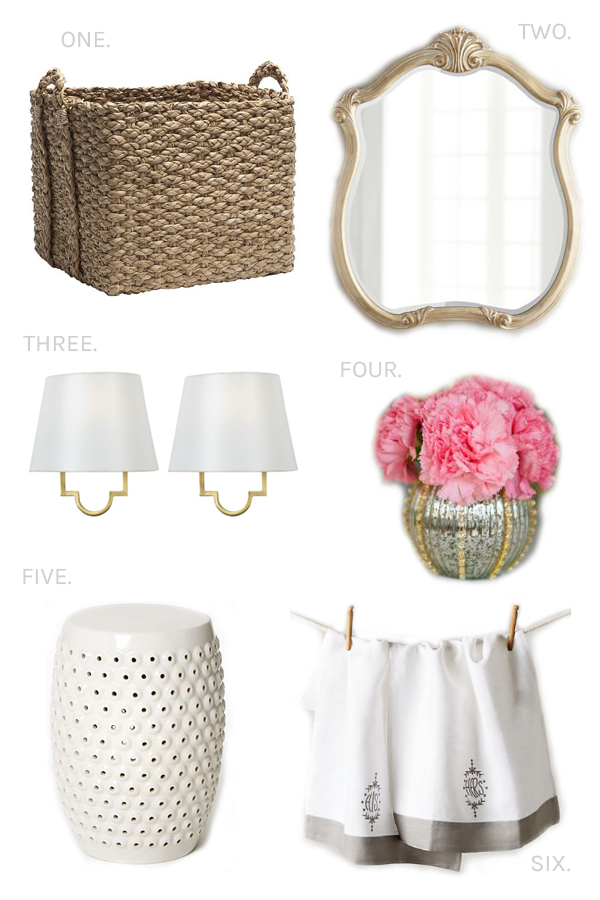
Today I’ve rounded up few essential accessories to get the look when it comes to my new favorite room. First and foremost, incorporate a wicker basket to help keep the small space organized. West Elm has a great selection ranging from $19 dollars to $50 dollars pending the size.

Fresh flowers are always a must.

Sconces are a great way to add additional light to the tiny room. And last but not least, hand towels are a great way to add color and/or prints. Whether you prefer monogrammed or “his and hers” hand towels, you know it’s all in the details!!

Powder Room 2


 Wicker Basket // Horchow Mirror (on sale!) // West Elm End Table // Sconces // His & Hers Hand Towels

Image via The Zhush