When it comes to updating a space, the gallery wall can be the perfect solution…when it’s done right. From entryways to dining rooms, an eclectic display of frames can be incorporated in just about any room. I personally love them above couches, in children’s rooms or hallways. Today I’ve rounded up five key design tips for creating the ultimate gallery wall.
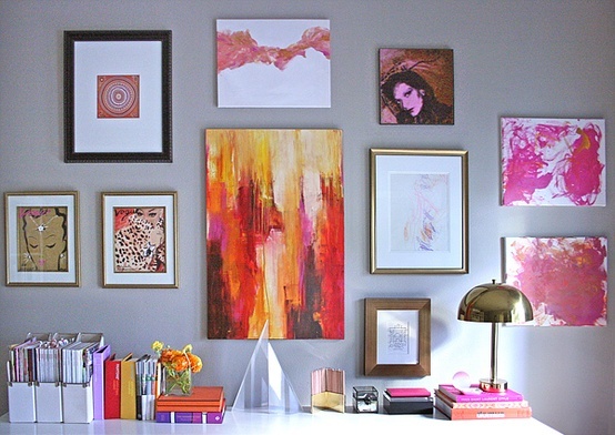
One. Keep to a general color scheme. This is key to creating a cohesive look with numerous pieces. Whether it’s black, gold or silver, a general color scheme will allow your wall to look clean and put together.
Photo via Erika Brechtel
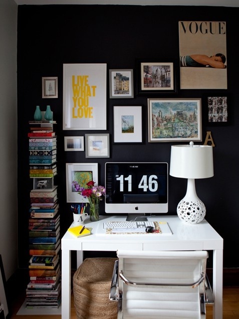
Two. Display paintings, prints and pictures. Are you drawn to black and white photos? Do you have one-of-a-kind artwork you want to display? This is the perfect opportunity to tell a unique story of your travels and adventures.
Photo via Alaina Karczmarksi of the Everygirl and Live Creating Yourself //Photographer Maia Harms
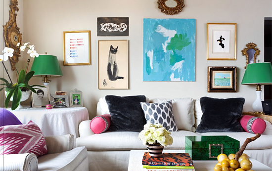
Three. Mix contemporary, antique and personal pieces. Mixing in antique frames is one of the best ways to add a personal touch. It’s also a great way to display items you have collected over the years.
Photo via Paloma Contreras of High Gloss magazine and La Dolce Vita
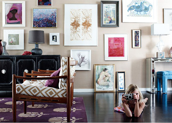
Four. Lay out the frames on the floor before hanging. This will help you visualize how your wall will look when it’s complete.
Photo via Angie Haranowsky
Five. Start with two to four pieces in the center of the wall. Don’t be afraid to use pairs and be sure to keep the frames at the same height to establish your focal point.
Photo via Angie Haranowsky
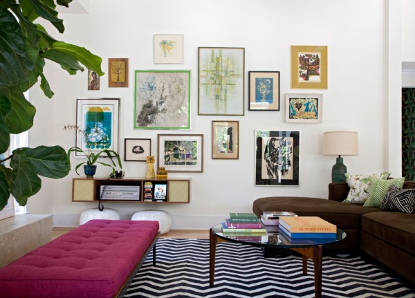

I think a color theme is certainly good, but not a must have.
I have been searching high & low for a gallery wall resource and, alas, I have found it! Beautifully executed! Thank you for sharing your lovely skills.
Limited color palette makes it easier for novices (like me!) to create a cohesive look; wide variety of colors is more difficult to execute. Not a requirement though if you have the skill.